Projects

320 mentorship project: phase 5.

The final stage! Woo hoo!

This post is all about going down memory lane, and doing some serious reflection. It’s the grading, report and evaluation stage!

Some of this may be repetitious, but I feel this was an overall rewarding and worthwhile experience (yay!). I will admit, I had my worries at the beginning for various reasons. One, is that despite my love of packaging, it doesn’t always love me. I don’t feel super good about any of the packaging assignments I’ve done so far so I was wary to try to attempt it again. Two, I heard from students and even Brandever themselves that the previous mentorship project outcomes hadn’t been extremely strong and weren’t considered for portfolio pieces. Which seems like a shame, considering how much time is put into this one project. BUT despite the odds, I feel this was successful and worth both my and Brandever’s time. Noice.

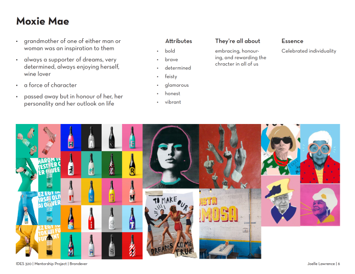
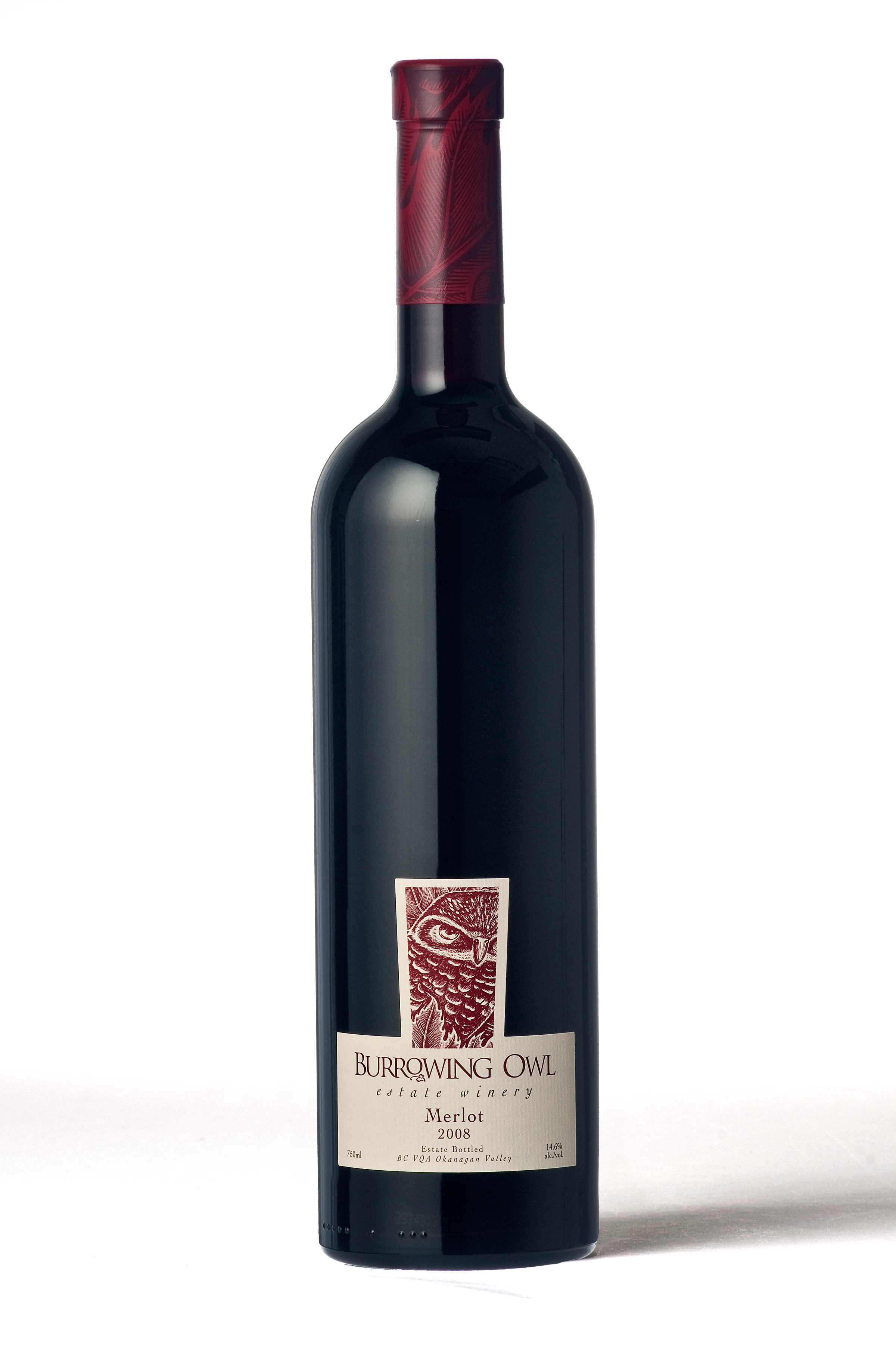
I learnt about many different things, including the limitations and strengths of the different materials and methods. Die cuts, embossing, debossing, foils, paper qualities, different types of ink, glass, the list goes on. And even though my assignment was purely fiction and therefore I could essentially do what I want, I still learnt about the restrictions and guidelines that have to be adhered to when packaging wine.

They also really encouraged me to think go big or go home. Part of Brandever’s success is their bold and punchy solutions. They aren’t afraid to take that step and redefine the ordinary. Anything that they can get away with, they will, which is one thing I loved about meeting with them and getting feedback.

Again, the most rewarding thing was finally seeing my ideas come to life (or at least more to life). And to see that this project has a lot of potential in terms of expansion. It’s exciting!

I feel the most challenging aspect was just wrapping my head around a 3D object (a pun perhaps?). That’s always the hardest part about packaging for me. Aside from the fact that there are individual restrictions on labelling and the required information, etc, there’s also just dimensional restrictions and so many things to account for.

Overall I feel as if I did fairly well with the brief given to me. I feel as if my ideation and execution could’ve been pushed, but I’m glad the project has legs and will probably still take me somewhere!

Thanks so much to Judy, and my lovely mentors at Brandever: Emily, Karen and Claire!

Standard
Projects

320 mentorship project: phase 4.

For my rationalize, articulate, and sell phase, my final collateral were finally due! Despite being given a set of deliverables at the beginning of the project, it did end up changing as the project progressed. Mostly because of time constraints, but also because after seeing more of my work, they decided that I didn’t necessarily need more digital media in my portfolio. The print deliverables were stationery, POS materials, and advertising. I only ended up doing some minimal primary packaging (a case of wine bottles), and a hang tag.

I took all the feedback from the previous stage/meeting and these are my finals below.

After presenting I got good feedback on some minor imagery and typographic things, and many great ideas on how I can expand the scope of the project and round it out next semester or even over the summer. All thanks to Emily, Karen and Claire!

I learnt (or at least should’ve) the importance of time management! Time and time again, I find myself scrambling to the finish line, even if I have a solid plan and an organized to-do list. Let me tell ya, running on less than 2 hours of sleep is not recommended.

The most rewarding thing was finally seeing my ideas come to life (or at least more to life). It felt great to present to Brandever, they really made me feel very excited about expanding Hapa and Moxie.

The most challenging thing was realizing the ceramic wine bottle. I feel like for the deadline and for now, the mockup I ended up with is fine, but I’d definitely like to get a real ceramic bottle and create some storytelling with some scenery photography.

In terms of self-assessment, I’d say that I successfully took their feedback into account, and created a solid foundation for a great portfolio piece.

Standard
Projects

320 mentorship project: phase 3.

For my push and refine stage my mentors asked me to come with rough label designs for both lines. They set a lofty goal of 15 designs for each, rounding out to 30 in all. Unfortunately I didn’t meet the 30, but setting a high goal still pushed me, (which I suppose was the intention anyways). Brandever encouraged me to not spend too much time on the nitty gritty and just quickly frankenstein labels together, by using placeholder imagery and fonts that have the same feel but maybe aren’t the final decision. That’s how they get quick ideas out and into the view of others.

Before starting the label designs, I took their advice and refined my brand story, background, and mission statement, more so for myself but also to make sure my moves going forward were grounded in something concrete.

I also came up with rough wordmarks for both the top and value tier. I tried not to spend too much time with them, but I’m really good at getting fixated on one thing and spending way too much time on it (hey, at least I know myself).

In terms of labels, for Hapa, keeping in line with idea of bringing things together, I came up with multiple concepts. Here are a few below. Most dealt with either physically bringing things together, or bringing the two cultures (Japanese and French Canadian) together.

For Moxie Mae my main focus was to really capture the character and tone of voice of the woman that the line is based on. She shared a close connection with her grandson (the co-owner of the winery) and often took care of him growing up. She was an inspiration to him because of all the hardships she persevered through (single mom, raised 3 kids on her own, all are successful and well off), and she always supported him in whatever endeavour he had. A strong supporter of following dreams and not backing down, she was bold, brave, and vibrant. Here there are below.

After pitching my labels, we decided on the strongest ideas and set the deliverables for the next meeting. For Hapa, the geniuses at Brandever suggested that I take the broken ceramic idea even further and make the tier ultra premium, and make it out of real ceramic with hand-painted gold accents and a hang-tag. Something I never would’ve even considered or thought of. For Moxie Mae, they suggested infusing paper textures and patterns in a Japanese style to still tie the two lines together and make sure the Japanese element is still felt throughout. As for the wordmarks, they wanted me to push the origami feel on the Hapa wordmark and to just do the Moxie Mae wordmark myself, and add a more angular feel to relate it back to the Hapa wordmark.

I learnt how important getting a rough idea down quickly but still nailing the tone and intended takeaway really is. I felt I could’ve done more ideation if I hadn’t been so precious with my work, and hadn’t spent all that unnecessary time on an emblem that I didn’t even end up using (oops).

The most rewarding part was pitching to them and getting great, smart feedback. They’re so knowledgeable, all of them, and it was amazing to hear their ideas for the project. They were just as excited as I was! (no pressure, hey).

I’d say the most challenging was the ideation in general, because of it’s intended scope and also not getting stuck on one thing/idea. As usual.

In terms of self-assessment, I’d say I had good ideas, but there still could’ve been more and I could’ve pushed harder in more varied directions.

Standard
Projects

320 mentorship project: phase 2.

For my ideation and exploration phase, my mentors asked me to come back with at minimum 3 name ideas and 3 refined concepts, including moodboards.

In all I ended up pitching 5 ideas. With free-range of storytelling, (I only know that my clients are a young couple who have a lot of money from the tech start-up business), I explored many different ideas and storylines. Here’s a snapshot of my 5:

Screen Shot 2018-03-20 at 9.26.52 PM

Screen Shot 2018-03-20 at 9.27.03 PM

Screen Shot 2018-03-20 at 9.27.13 PM

Screen Shot 2018-03-20 at 9.27.21 PM

Screen Shot 2018-03-20 at 9.27.30 PM

After reviewing all 5, they helped me weed out the weaker ideas and identify which had the most potential and interest. We decided to slightly change a few and merge two together. Hapa would be the over-arching winery name, and top tier and Moxie Mae would be child name and the value tier.

I learnt some clear insight into why my strongest ideas were the strongest (not many wineries are based on a matriarch, and not many have Asian influences), and the different options i have in terms of papers and foils and printing techniques (they were kind enough to show me some examples and go through some sample books with me).

I found the ideation challenging only because it was very open, and I find sometimes that hinders my creative process rather than add to it. I am a Libra and too many options are of course, my achilles heel.

It was most rewarding to settle on a solid direction, especially because not only am I further developing one of the ideas I liked most, but both of the ideas I liked most. (Score!)

In terms of self-assessment, I feel as if my pitched ideas could’ve been more fully fleshed out, but I’m happy I exceeded the minimum number amount.

Standard
Projects

320 mentorship project: phase 1.

For this project I am lucky enough to be mentoring with the lovely gals at Brandever. It’s been a time trekking out to Kerrisdale (luckily, it’s just one bus), but I think we’ve developed a project with potential and I’m excited to continue to work on it.

I chose Brandever because they specialize in packaging and that’s something that I had wanted to refine my skills on and hopefully create something portfolio-worthy. So, my brief is to help a young couple who’ve bought a failing winery by re-branding and developing a new naming system/look for their top tier and value tier lines of wine. The deliverables will be 4 wine labels in all, 2 top tier, 2 value, each a white wine and a red. Plus any additional print collateral that seems fit (ie stationery, pos materials, advertising). The brief was intentionally very brief to allow me to create and develop my own story and details.

My target audience is fairly broad as essentially anyone from the age of 19 up can purchase and consume it. The top tier would target a more serious wine drinker, one who can afford spending extra money for quality and who would potentially give it as a gift, or at least cherish it. They are most likely older in age and earn more money. The value tier would be targeted towards a younger demographic. They care less about quality of wine and more about just having a good time, and having fun.

I conducted various types of research firstly by seeing what the competition was like in-store, taking photos for things to keep in mind, and things to stay away from. I then did more research online, looking more into the story of wineries and what their messages are. I also did basic wine research to better familiarize myself with my product I’m dealing with (types of wines, their characteristics, wine terminology, etc).

Through my research I identified areas to stay away from. Here are some examples of almost every single wine bottle you see:

Centre aligned text, typical and safe hierarchy, small image with wordmark logo, if there’s colour it’s usually red or purple. All are very common and things I wanted to avoid.

Through my research I also identified areas of opportunity. Bold use of colour, interesting label shapes, cut outs, embossing and debossing, foils, and 3d elements were all things I took note of. Here are some examples:

I found my research and the feedback I got the most rewarding. They really helped me to take a step back when I needed to and focus on the storytelling and naming before jumping into the visuals. It really showed their approach to smart, purposeful design.

I found it hard to research without jumping into concepts, that was the most challenging in the research phase. But other than that, researching and gathering went smoothly.

In terms of self-assessment, I would say that I did a good amount of research, and wide variety as well. I’m satisfied with this stage for sure.

Standard
Projects

editorial design: re-design.

Welp, now that this is done, I can’t tell if it’s really that significant of an improvement. I hope it is.

Hah.

Anyways, here we are. My editorial design do-over.
I chose to re-do the article concerning design internships because I felt good enough about my end result last year in order to pick it up and try to make it even better. I decided to stay with the idea that the individuals who have money can afford to be creative, and the concept of showing that through money origami. This time around, I changed the origamis to more design-related things like cameras, computer mice, and coffee mugs. As well as, tried to show more of the concept with my main image on my opening spread, rather than just going the decorative approach like the old version. The new main image is a potential design intern made of money, pitching his big idea to prospective employers.
The magazine I chose to base my design off of last year was Nylon. I like Nylon for their imagery, use of colours, and target market, but there were many structural things that I didn’t want to adhere to this time. So, for just essence and target, I drew inspiration from Nylon and Scout. (moodboards below)

For the structure, layout and type treatment, I based my spreads on both Frankie and Local Wolves. (moodboards below)


Here’s my final result: joellel-editorialredo-finalfinal

Screen Shot 2017-11-22 at 1.41.25 AMScreen Shot 2017-11-22 at 1.42.14 AM

Also here’s my previous blog post to compare: here

Overall, I’d give myself an 8.5-9 out of 10. I’m happy with my typographic layout and structure this time around, I feel like there’s balance and cohesion. And there’s no singular, awkward body paragraph, like the last one. Which is great. I’m also much happier with my sidebar content in terms of topic and visual interest.
I still feel like the concept could be pushed further or better articulated/shown. I found that to be challenging.
And looking at it now, (and even though I like the way it looks), I also feel like there’s a missed opportunity to really show off my origami illustrations. Especially with all that white space I had to work with.

Ah well, maybe third time’s the charm?

Standard
Projects

editorial design: pub survey.

Despite probably not basing my new editorial article on the magazine I analyzed, I still found this assignment helpful. It was great to see a survey of various publications from everyone. It was like doing a bunch of research, without really doing it!

product-1721-110606

I would give my team a 9 out of 10. I feel we met the requirements of the assignment and worked together well.

One thing I found challenging was to actually find good examples of my particular magazine. I bought one in store, but it was hard to find other examples online. So comparing between multiple issues proved to be a tad difficult.

I feel the only thing we maybe could’ve improved upon would be to rehearse the presentation and present/deliver in a more engaging way.

But other than that, I’m fairly happy with our collective result.

Standard
Projects

reconciling canada.

To close off IDES 244, it seems like the most important project was saved for last. I’m really thankful for the experience of researching and completing this assignment. The topic and act of reconciliation in Canada is such a crucial, current issue yet hardly anyone’s actually heard of it. It’s alarming and, to be quite honest, a little disheartening. Over the few weeks we spent working on this project, it sparked some much needed conversations (even in my own home, but those weren’t as pretty. Buuuuut, we don’t need to get into that).

Our task was to create a communication design piece for Reconciliation Canada that helps teach/inform Canadians about reconciliation. I chose to partner up with Ryan for this assignment, and as we were brainstorming what specific message we’d like to convey and what particular audience we’d like to convey it to, we both realized that despite the ease of access to information and changing of outdated viewpoints, the younger generation is still very unaware and still being influenced by the generation before. And considering they’re the future, that needs to change. (Also, not to say that anyone over 40 is a lost cause, but let’s face it, it’s a lot harder to teach an old dog new tricks).

To me, one of the most import steps towards reconciliation is gaining the skill of empathy. Without it, understanding cannot happen, and change cannot be made. Humans fear what they don’t understand, they always have. Holding back judgment before you get to know someone, seeing that they’re human like you, taking the time to understand them, and putting yourself in their shoes are all integral, not just for the purpose of reconciliation but, for life in general.

In order to help facilitate empathy in young people, Ryan and I decided to try to break down the misconceptions surrounding Indigenous people in North America by showcasing individuals who are not only members of various NA Indigenous nations but have also excelled in their chosen field/passion. These individuals would help to be an inspiration for Indigenous youth, and help to shut down stereotypes among non-Indigenous youth. Our chosen method was a poster series, where each individual would be featured. These would be strategically placed in communities and elementary/middle schools/classrooms, based on the persons job/achievement. These posters are aimed towards youth, ages 10-14.

Below are our moodboards:

Screen Shot 2017-04-22 at 1.19.54 AM

Typography inspiration

Screen Shot 2017-04-22 at 1.20.05 AM

Illustration style inspiration

And here are our final posters (we did three, but ideally there would be numerous different ones for all areas of careers/achievements):

To go along with our poster series, we have a call to action, leading viewers to a microsite where they can find more information on each individual through a small written bio and a short approx 1 min long animated video. This site along with the posters would be teaching aids for teachers to utilize in class.

Below is our microsite:

Our site consists of a landing page (first image), which viewers can then click ‘explore’ and would be scrolled down to the collection of profiles (image 2). Once hovered over, one would drag out and their name and title would appear (image 3). Once clicked, a page would pop up with the bio and video (last image).

Overall, I’m really happy with how this turned out. I think Ryan and I really worked together well, and I’m glad that our process was so seamless. I would give us a 9 out of 10. I believe we have a strong concept and a well-executed idea. It fits our target market and effectively conveys the message we want to send, and elicits the proper takeaway message as well.

Now if only all our Indigenizing IDEA projects were real!

FULL PDF: RecCan-fullproject(opt)

Standard
Projects

full footprint.

I believe this final assignment was a really nice change of pace for us/myself. We don’t get to collaborate much, so this made for some really good experience. Though frustrating at times (‘oh I can’t do that, because I’m waiting for so-and-so to get back to me on this’, etc etc), I think in the end it feels a lot more rewarding knowing you’ve all come up with something together. It’s also nice to be able to just focus on a small aspect than try to do the whole thing yourself.

My team was in charge of revamping Full Footprint, a non-profit business out of Toronto who provide ways to measure environmental footprints, decrease our negative impacts, and increase our positive impacts. For anyone looking to do so, one can purchase any of the offsetting packages provided online, and that money will go towards evening out your personal negative impact.

As a group we brainstormed and mind mapped, eventually coming up with numerous things we could improve upon and implement.
Within our group, Charmaine and I took on a partnership portion. We believe partnerships are a great way to gain some exposure, brand recognition and loyalty. We created a package that could be given out to local businesses (legal firms, insurance companies, design firms, etc) that would propose a mutually beneficial partnership with Full Footprint. The pamphlet explains who Full Footprint is, what they have to offer, and the benefits of offsetting. If agreed upon, Full Footprint would help offset the company’s carbon, land and water footprint, and a selection of branded materials would be sent to the partnered business to give out and display; showing their clientele that they act on their values. The materials would include stickers, small window decals, and cards. We thought that this would be a good way to reach out locally and work from there. This benefits the businesses and injects a bit of Full Footprint into people’s everyday lives, with a clear path directing them to the website in the end.

Screen Shot 2017-03-21 at 6.11.47 PMScreen Shot 2017-03-21 at 6.17.52 PM

Screen Shot 2017-03-21 at 6.17.59 PM

These are all the final material designs, which I was in charge of, but all the images recounting our process can be found on Charmaine’s blog.


I feel really good about how our portion turned out. It is obviously open for tweaks and changes to further fit Victoria’s needs but, I wholeheartedly think it could be useful for Full Footprint if implemented; I hope Victoria thinks so too!

Standard
Projects

editorial design: more than meets the eye.

I’ve always loved magazines and the print medium, and have thought that it would be a potential career option. Luckily this project didn’t change my mind, it just expanded it. There are so many terms and components that I had never even heard of (but I mean, if I had, why am I even here, right?). I found it all very interesting and executing the spreads was a great learning opportunity.

I chose the article concerning design internships and whether going unpaid is the right course of action, and what that means for the industry. It took me a long while to actually come up with a visual/conceptual idea to be the foundation of my spreads. The magazine I chose was Nylon and luckily their diverse spreads and unique styles within each issue gave me a sense of freedom in choosing my imagery. Eventually, as I was riding the bus home one day, I thought of the fact that to me one of the biggest things the article was saying was that the individuals who have money can afford to be creative. So what’s one way you can get creative with money? Literally, with origami.

screen-shot-2017-02-22-at-2-32-20-pmscreen-shot-2017-02-22-at-2-32-41-pm

I based my illustrations on real origami patterns that are out there, all made up of dollar bills. Unfortunately, not many patterns made design intern related shapes, which would’ve been ideal. I chose to stick to a fun colour palette to stay consistent with the publication and my moodboards. All my typographic/layout choices (pt size, leading, typefaces, margins, column numbers) were based on Nylon as well. I couldn’t find the exact typefaces but I did my best.
I included a department header titled ‘radar’, (which is a real category in the magazine). And I didn’t include a footer along with my folios, as Nylon doesn’t include them. 


screen-shot-2017-02-22-at-2-34-04-pmscreen-shot-2017-02-22-at-2-34-23-pmscreen-shot-2017-02-22-at-2-35-28-pm
Overall, I wish I had given myself more time for the execution (as usual), and I don’t know what I was thinking with the body paragraph on the last page. It feels so awkward, in hindsight. BUT other than that I’m happy with how it turned out. Would love to do another assignment like this, or even revisit this one. I’d give myself an 7.5-8 out of 10 (partially for lateness).
Standard